


.png)



How do you reposition a platform that 10,000 customers love but the wrong customers keep finding?
Rebrand to delivery Complete
Design Sprint & Rebranding
Visual identity overhaul
.png)
What we did:
01 — Repositioned around creator frustration, not platform features
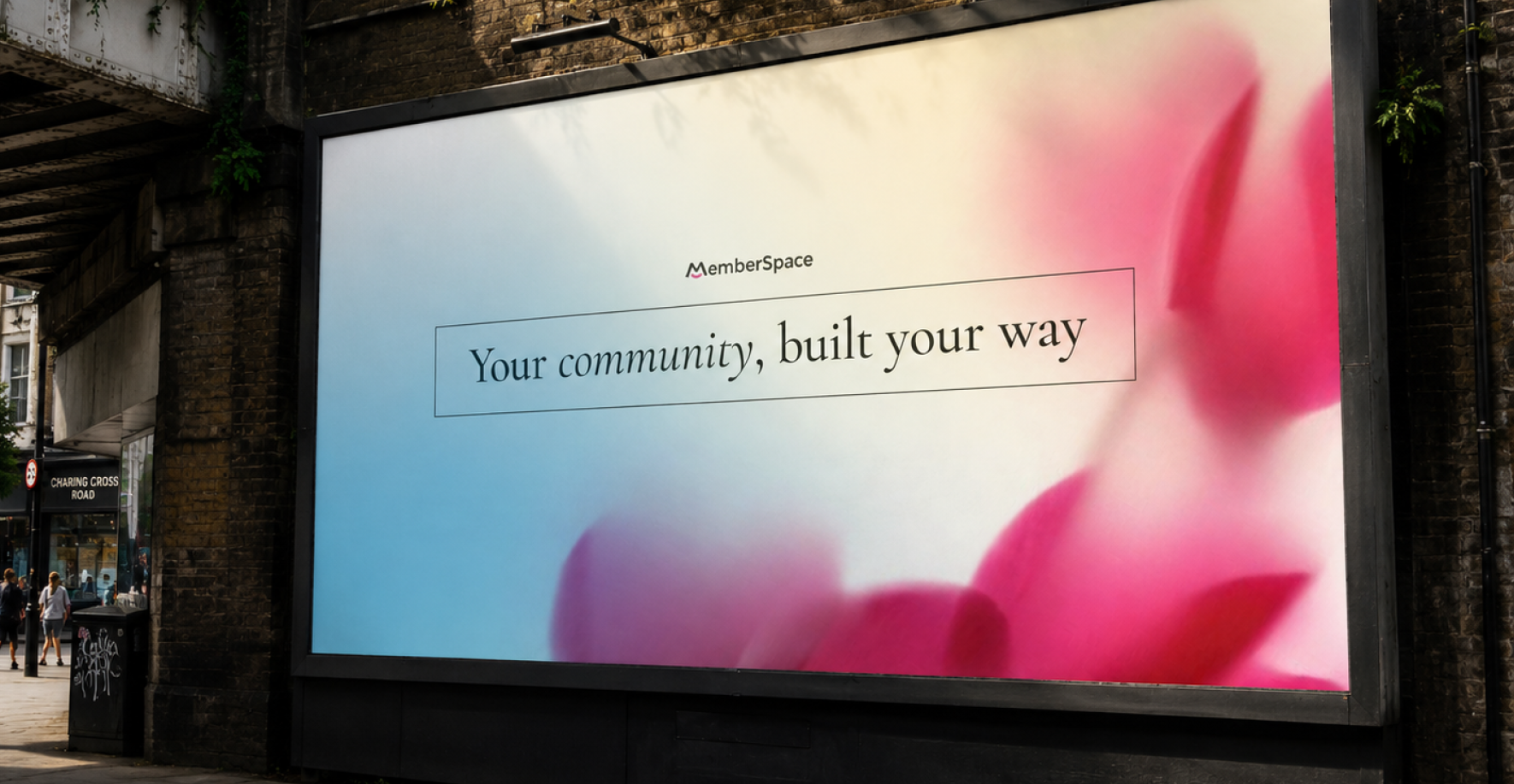
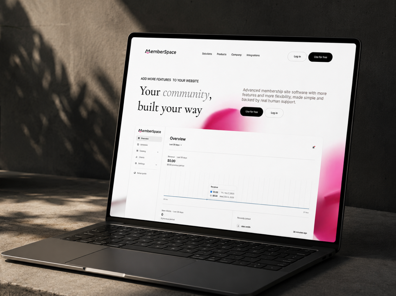
The core insight from ICP research: creators don't want a membership tool. They want control, over their content, their community, and their income. We repositioned MemberSpace around that frustration. "Your community, built your way" replaced "membership software with more features and flexibility." Same product. Different entry point.
02 — Visual identity refresh
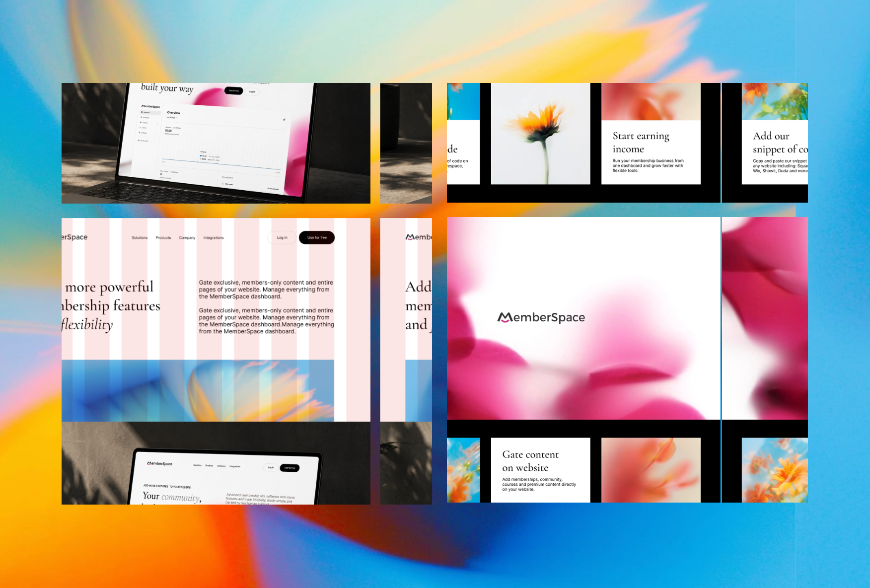
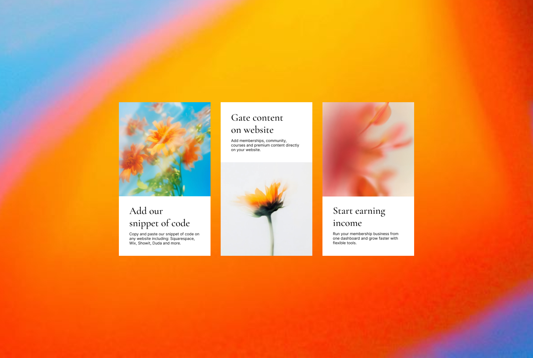
Updated color system, typography, and photography direction built around the new positioning. The visual language shifted from generic SaaS to a brand that felt human, premium, and built for people who take their work seriously. Photography direction: real creators, real workspaces, real community — not stock photography of people at laptops.
03 — Landing page redesign — desktop and mobile
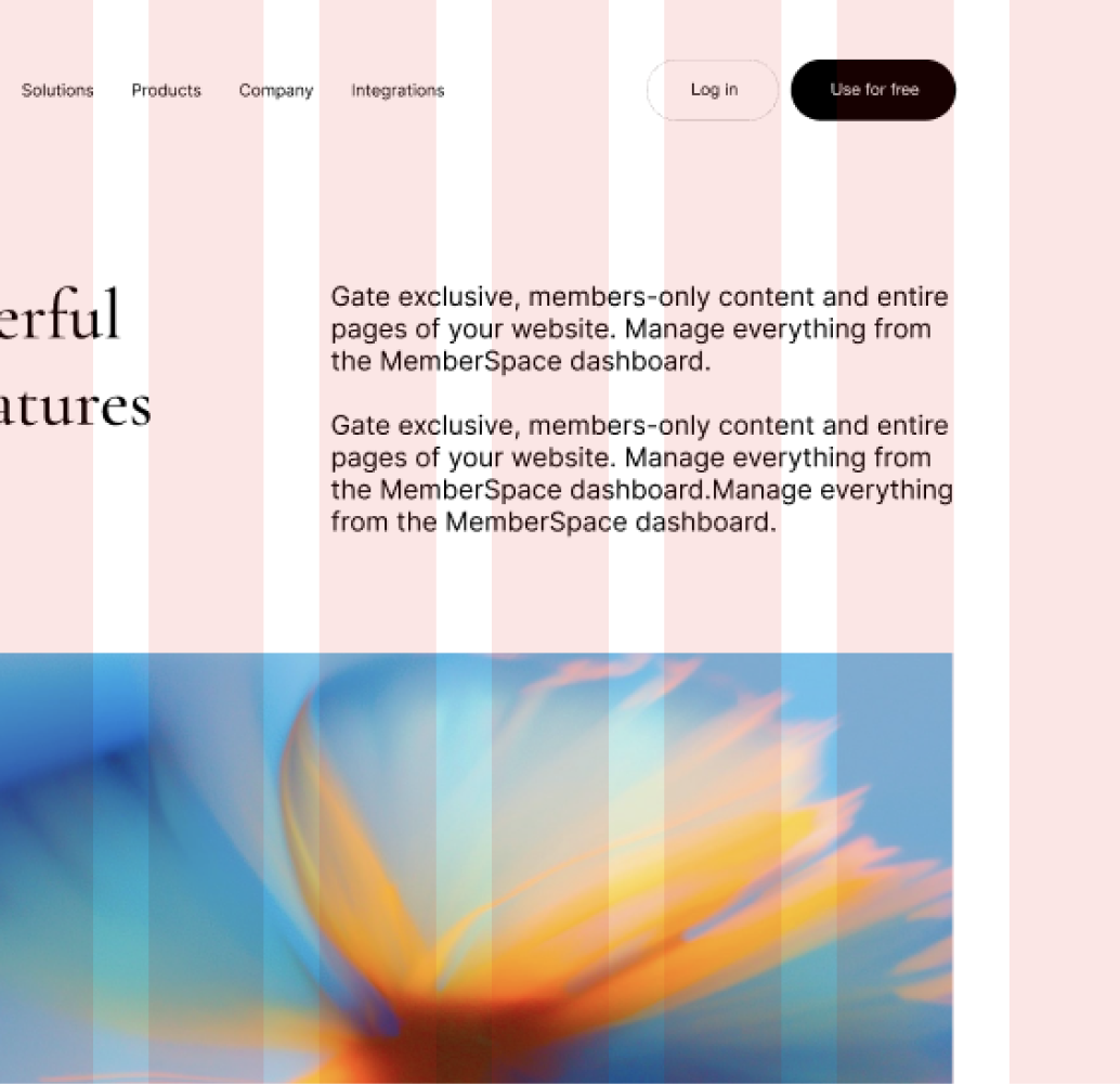
Full redesign in Figma. Hero section leading with the outcome creators actually want. Feature sections rewritten to address the specific anxieties of someone who has been let down by a previous platform. CTA hierarchy restructured around the moment of decision.
04 — Messaging framework for all channels
Pain-first communication framework mapped across the full funnel, homepage, email, social, ads. Every touchpoint leading with the creator's frustration before presenting MemberSpace as the answer. One message, every channel, zero inconsistency.
05 — Content and social media framework
A content and social media communication framework mapped to subscription growth, what to say at each stage of the buyer journey to move someone from aware to converted.
The result:
Positioning shifted from "membership tool" to "the platform that puts you in control of your community and your income." That distinction directly impacted how decision-makers engaged with the product, the moment a creator reads their own frustration reflected back at them, the evaluation becomes a confirmation, not a comparison. The rebrand gave the sales and marketing team a clear answer to the question every prospect asks: "Why you and not the three other tools I'm looking at."
Explore more projects


The partner that makes your marketing team unstoppable
Completely free. Immediate recommendations.



.svg)


.svg)

.svg)