


.png)



Taking Delectus AI from a complex product demo to a brand enterprise buyers understand in 30 seconds.
Sprint to delivery
Brand system, landing page, dashboard UI
Built for enterprise credibility
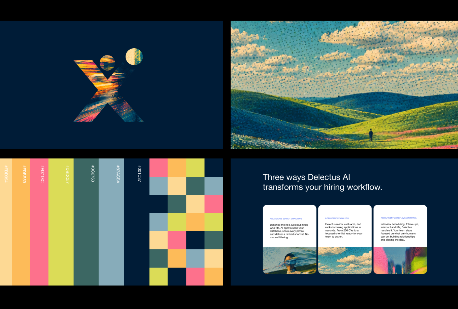

What we did:
01 — Repositioned around recruiter outcomes, not AI features
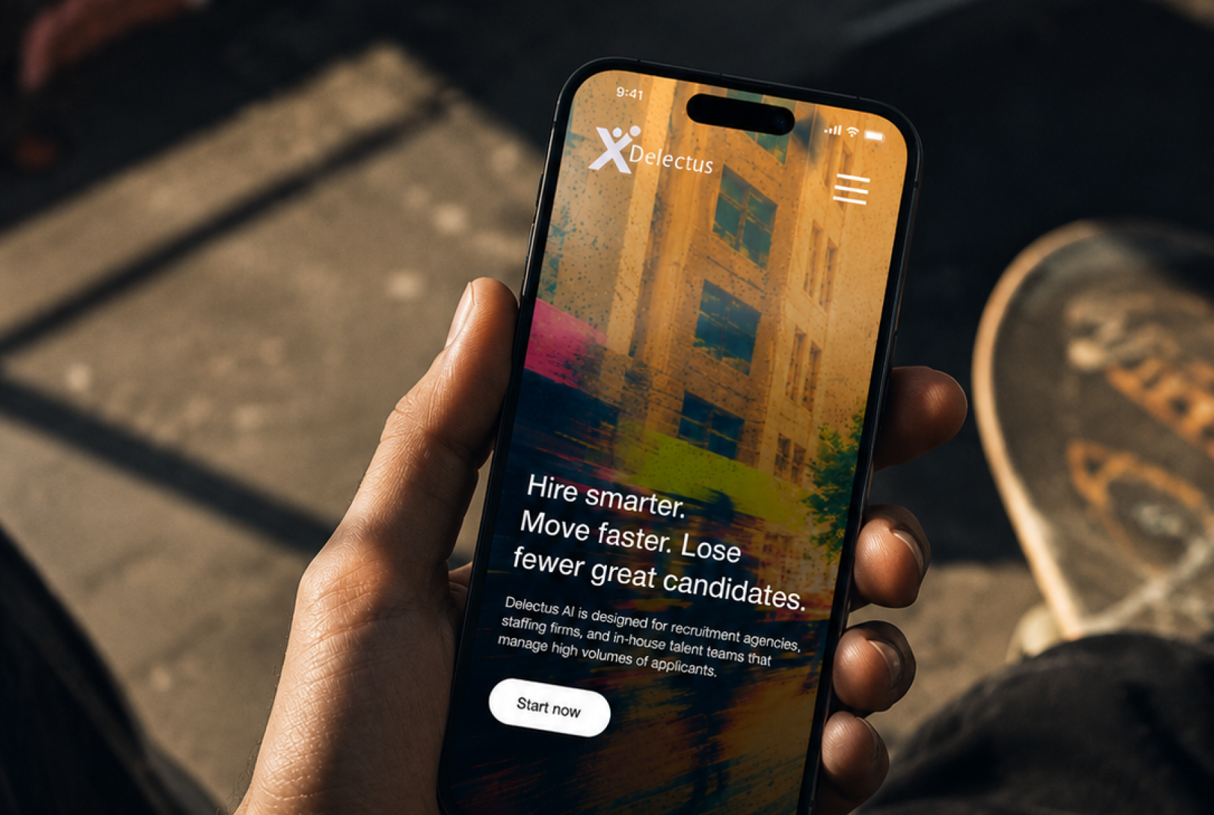
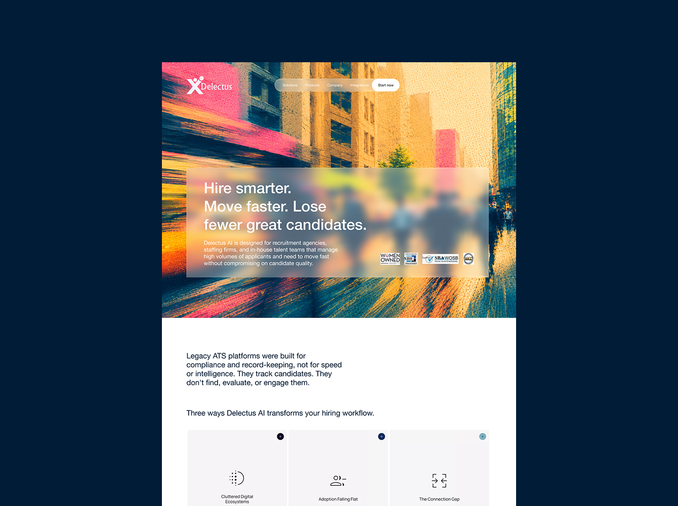
Before designing anything, we reframed the core message. Not "AI-powered ATS with candidate matching" but "Hire smarter. Move faster. Lose fewer great candidates." Every visual and copy decision that followed was built on that foundation. The brand started speaking to what the buyer is evaluated on internally, not what the product does technically.
02 — Visual identity built for enterprise credibility
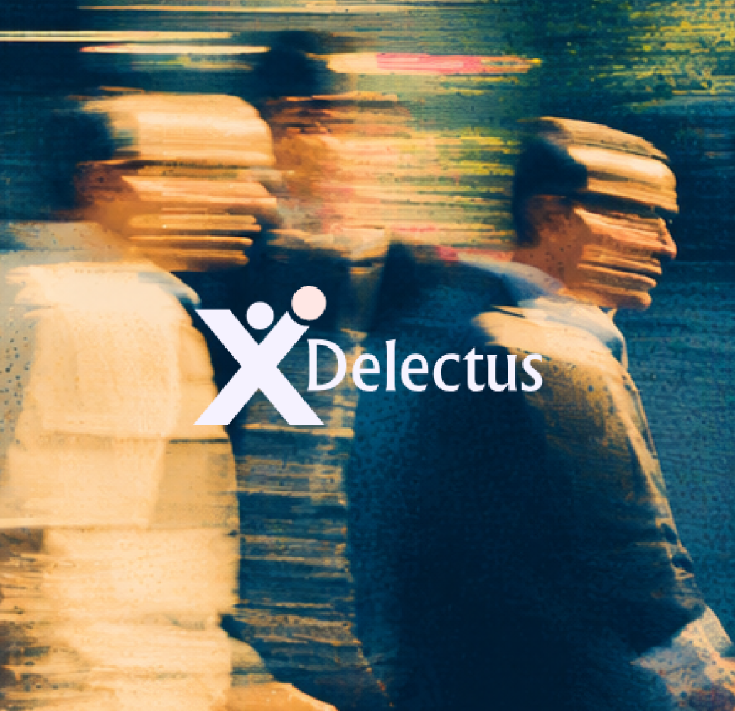
A complete visual identity system: logo and logo variations, color palette, typography, design elements, illustration direction, and photography style. The direction balanced precision and trust, the visual language of a platform that belongs in an enterprise stack, not a startup pitch deck. Everything defined before a single execution was designed.
03 — Landing page — desktop and mobile
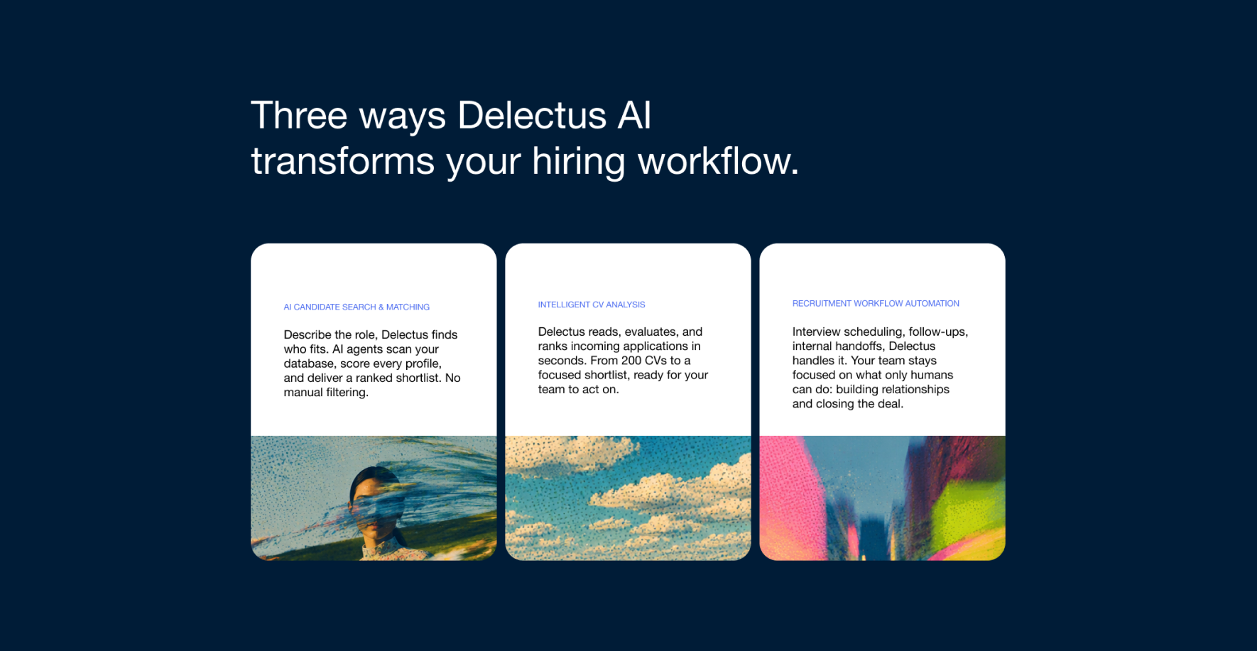
Conversion-focused layout built in Figma. Hero section leading with the outcome, not the feature list. Social proof and trust signals positioned where procurement buyers look first. Mobile version designed in parallel not adapted after the fact.
04 — Dashboard and core product screens
Key SaaS dashboard screens and core product pages designed to match the new brand direction. The product needed to look as advanced as it actually was. These screens gave sales teams assets that matched the credibility of the pitch.
05 — Design system foundations
Component library and design system foundations ready for development handover. The sprint ends, the team can build without starting from scratch.
The result:
Prospective clients understood what Delectus AI does, why it matters, and why it's different, without reading a technical spec. The shift from "AI features" to "faster hiring, better candidates, less manual work" changed how the product landed at first contact. The sales team had a brand that could carry the weight of the first impression before the demo was even booked.
Explore more projects


The partner that makes your marketing team unstoppable
Completely free. Immediate recommendations.



.svg)


.svg)

.svg)