

How do you reposition a platform that 10,000 customers love but the wrong customers keep finding?
Rebrand to delivery Complete
Design Sprint & Rebranding
Visual identity overhaul

.png)
What we did:
01 — Brand Audit & Discovery
We mapped what the existing brand was communicating versus what MemberSpace's best customers were actually buying. The gap was significant and specific.
02 — Repositioning
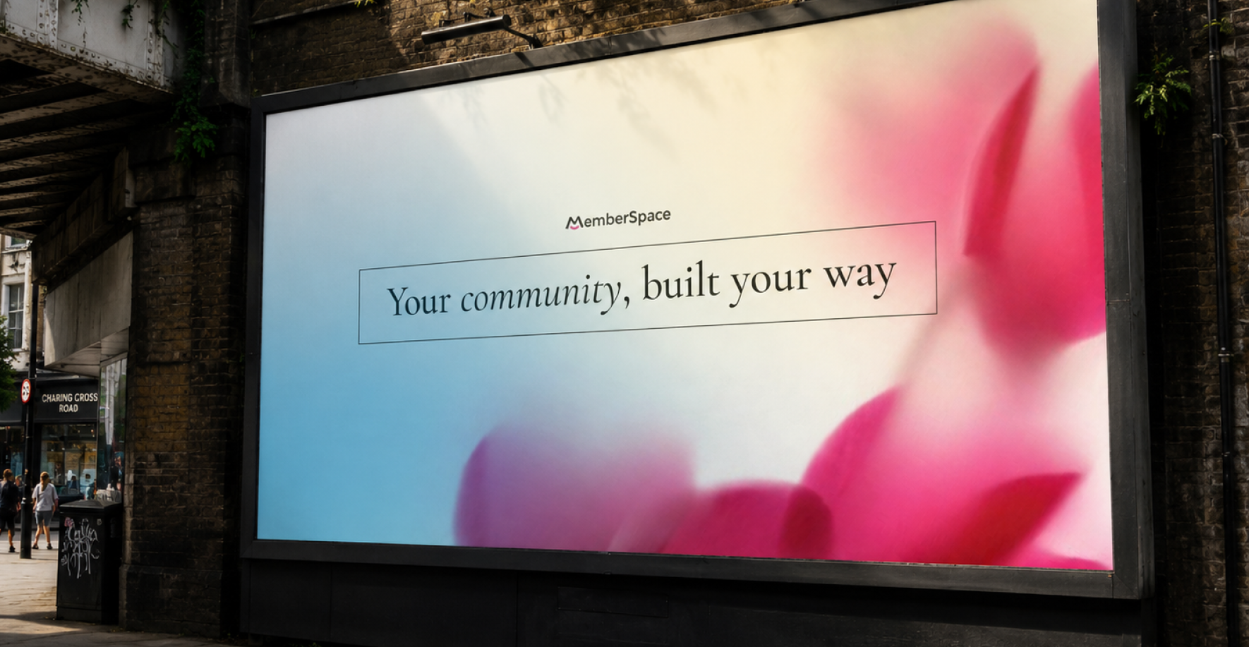
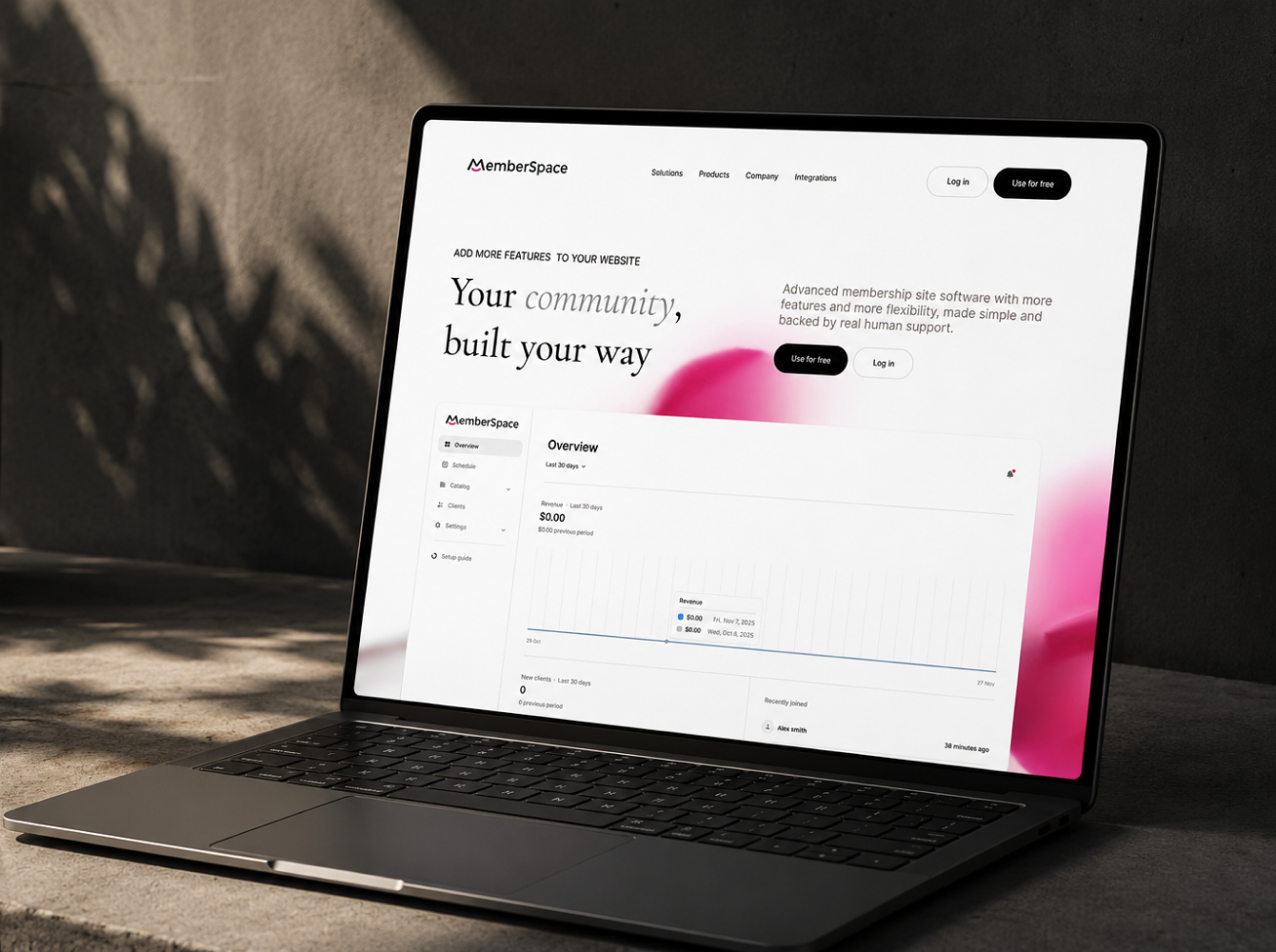
The brand was rebuilt around the frustration serious creators feel with platforms that limit their control and take a cut of their revenue. The new positioning: "The platform that puts you in control of your community and your income."
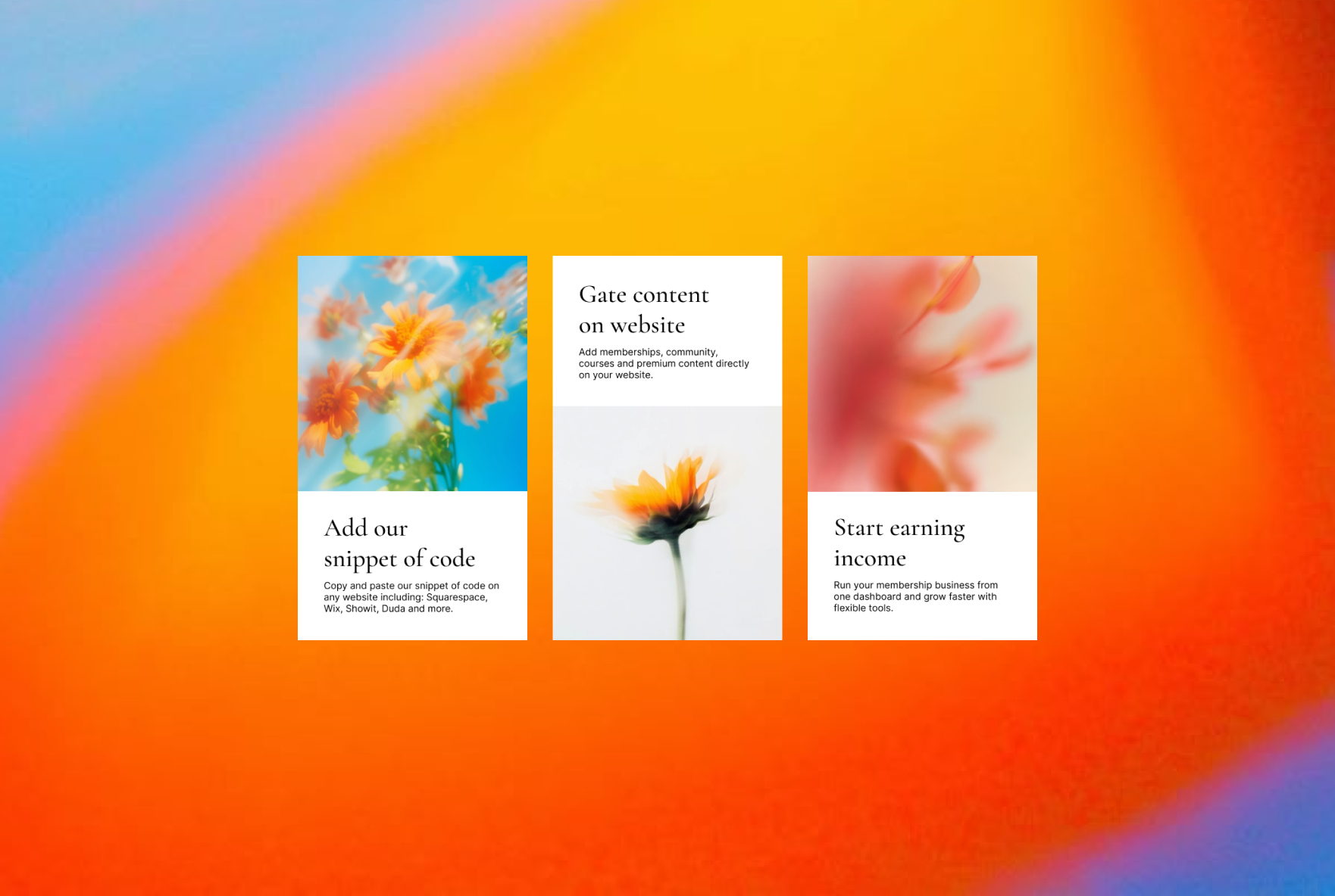
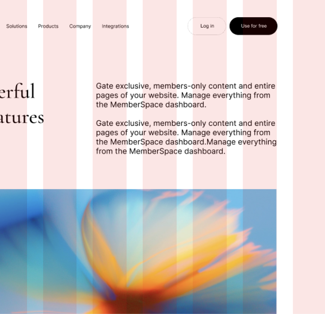
03 — Visual Identity Overhaul
Complete rebrand, logo refresh, color architecture, typography system, and component library built for consistency across marketing, product, and social. Everything scalable. Everything documented.
04 — Pricing Page Strategy
The pricing page was restructured to support MemberSpace's shift toward higher-value plans and business buyers. Plan architecture, copy direction, and CTA hierarchy rebuilt to reduce friction at the highest-value point in the funnel.
05 — Content & Messaging Framework
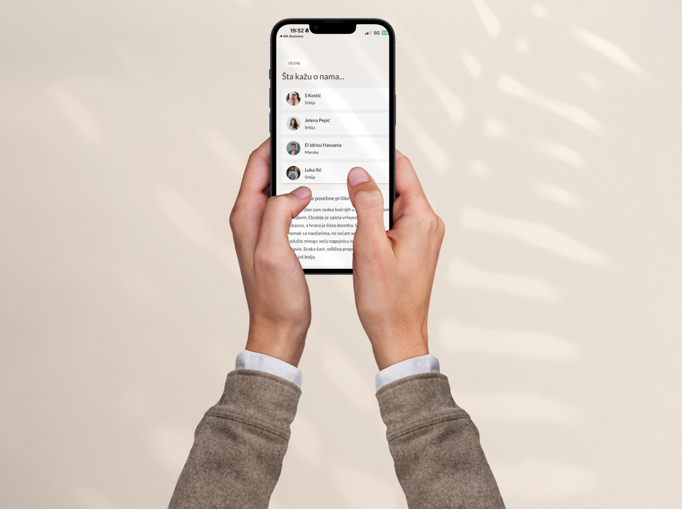
Social media communication framework and content direction mapped to subscription growth and retention, not just acquisition.
Team on this project:
Brand strategist, UI/UX designer, art director, and copywriter.
Weekly updates throughout, integrated in Slack.
The result:
Positioning shifted from "membership tool" to "the platform that puts you in control of your community and your income." That distinction is not cosmetic. It speaks directly to the moment a serious creator decides whether to trust a platform with their entire business and it changed the quality of customers arriving through organic search and referral. The pricing page restructure gave enterprise and team buyers a clear evaluation path that hadn't existed before, reducing friction at the point where MemberSpace was previously losing its most valuable potential customers.


.svg)


.svg)

.svg)